Tuesday, November 5, 2013

Let the printing begin

After much fiddling around; the text written and edited, the pages designed, the paper cut, the images carved, the plates (for the most part) made; I have finally made the terrifying leap and started the printing.


All eight center spreads laid out in the studio.


The center spread for the Coast Live oak printed on kozo.

Now all that's left to print is 80 pages or so. Stay tuned.

Sunday, August 4, 2013

Plant specimen printing test

Doing tests of my fabulous new technique for letterpress printing plant images for my new book.


They are printed from light to dark. Here's the base light yellow green then the second dark green.


Then the third run is printed in red.


Here's the final four color print with the black detail plate added of a laurel sumac seedling. I ripped the specimen out by the roots where it popped up in my front yard.


Here's a final four pass print of leaves and baby acorn buds from a Valley oak, my personal favorite tree of all time.


Friday, June 7, 2013

New type part2

In addition to the metal type I found some lovely Gothic XX condensed wood type on eBay. It can from Italy so the size is a little weird like 11 line or about 1 3/4 inches tall. The front is complete with multiples of most letters and numbers. This type will be overprinted by the 36 pt California italic for both the common and botanical names of native plants.


Isn't it amazing?

New Project means new type

For my new book described below I purchased some new type. In keeping with my California theme the text type I got from M & H in San Francisco is California Old Style. It was originally designed in 1938 by Frederic Goudy as a proprietary typeface for the University of California. 

I love new type and the very best part is putting it away.


This is the 36 pt italic. It has some fancy ligatures, as you can see.


Here's another example of its wonderfulness with fancy alternatives for "v" and "w". I love that.


Here's the 12pt italic all wrapped up. I relish the unwrapping and untying of the shiny new type.


The other packages contain the 12pt California roman. The two blue labelled one have capital letters and the six yellow labelled ones contain lowercase. When setting a book's worth of type you need a lot more lowercase type than capitals. It would be totally awesome to be able to set all the type for the whole book with what I have. We'll see.

Monday, June 3, 2013

New project

I've been working on a new book for months about the trails around my house where I walk everyday. I have changed my mind so many times about how it's going to be: what it's about exactly, what it's going to say and what it will look like. I've done many printing tests on multiple kinds of paper. I have been thinking about this continually and I've finally got it pretty much figured out. I don't what to give too much away, it might jinx it, but I will show some of the printing tests and binding dummies.


Here's dummy number 5 & 6 along with some images printed on mulberry paper. If you look closely you will see mountains in the background. The linoleum blocks are printed verso and the paper is folded in half. This technique was discovered purely by accident.


Here's a closer look.

Dummy number 4


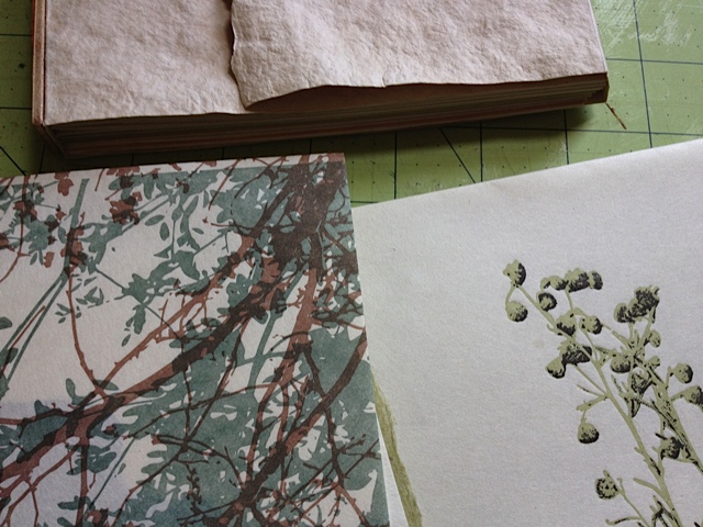
More printing tests but this time on 100% abaca paper handmade by Katie MacGregor. This paper has the most wonderful rattle, like walking on dry leaves. You can't really see it but this is dummy number 3, sewn on willow twigs. Cute but a little too crafty. 

I am using multiple papers. The papers I've decided on will be the abaca, handmade Katie wove and the mulberry combined in each signature. The handmade papers won't be made until later this summer but I can get the mulberry from Hiromi and at least start printing that part of it sooner.

Friday, May 3, 2013

Book Structures class final day

Yesterday was the final day of the Book Structures class I teach at Otis. The students set up a display of their collection of up to 30 books that they learned to make over the course of the semester. It was a great group of students and they all did an amazing job. Many of them have also taken my Intro to Letterpress class for double the fun down in the basement.

The photos were taken by the best binding TA in the whole wide world, Jennifer Graves.


Monday, April 8, 2013

Finally, I have a type cabinet!

A casualty of the Otis Lab Press remodel, this old type cabinet finds a home in my studio. I can finally get the cases of type that were stashed here and there put in a proper place and even buy more type!

It just needs a little TLC and some more cases and it will be perfect.

The big book press (also from Otis) which had been inconveniently located in the upstairs office finds just the right spot on top.